Canadian marketing has a built-in curveball: bilingual marketing in Canada means working across two official languages. Many customers don’t treat English or French as a preference. They expect to be addressed in the language they live in. Done well, bilingual marketing expands reach, builds trust and makes your business look more established. In some regions, it also supports customer-facing language expectations for printed materials and signage.
This guide lays out a practical bilingual plan that goes beyond translation, shows how to write English and French messages that sound natural, explains how to design bilingual print materials that stay readable and covers how to connect print to digital with QR codes, short URLs and language-specific landing pages.
- Canadian marketing is unique because English and French shape how customers understand, trust and act; and language expectations change by region.
- To plan bilingual marketing strategically, start with one clear message framework, then adapt language and execution based on audience and channel instead of translating blindly.
- To write effective marketing messages in English and French, prioritize clarity, match tone and formality, and focus on intent so both versions feel natural and aligned.
- To design bilingual print materials, choose layouts that support scanning, enforce strong visual hierarchy and trim copy until both languages stay readable.
- To connect digital and print for more impact, guide people from physical materials to the right language online using clear URLs, QR codes and landing pages.
Why bilingual marketing matters in Canada (French and English audiences)
If you run a business in Canada, bilingual marketing belongs on your radar. It’s part of doing Canadian marketing well, especially when your goal is growth, stronger customer trust and fewer missed opportunities.
And the truth is, you don’t need perfect bilingual skills to get results. You need a plan for how French and English show up across your brand, and where it will move the needle.
Canada has two official languages – and customers expect to be spoken to
Canadian customers look for signals that a business will be easy to deal with, clear and credible.
Based on 2021 Census language data (first official language spoken):
- English-speaking Canadians: 27,881,228 (76.1%)
- French-speaking Canadians: 8,066,633 (22.0%)
- English–French bilingual Canadians: 476,175 (1.3%)
In practice, customers reading in their first language move with less friction. They grasp what you’re selling, understand the terms and take action. If the wording feels like work, they slow down, lose confidence and bail.
Good bilingual copy keeps your offer crisp. Prices stay clear, benefits stay specific and your CTA sounds like a real business talking to real people.
Regional realities: Bilingual Canada isn’t evenly distributed
Bilingual demand changes fast once you cross a provincial border, so your marketing should flex with your market.
- Quebec: French-first. Customers expect French across the journey.
- New Brunswick: Officially bilingual. Two languages in public-facing materials is standard.
- Ontario: Francophone pockets where French can lift response and loyalty.
For an effective French-English Canada strategy, prioritize the regions and touchpoints that affect revenue, then apply the same discipline you already use for pricing, branding and customer experience.
Source: Illustration by Juh D. via 99designs by Vista
What bilingual marketing unlocks for small businesses (specific benefits list)
Once you’ve mapped the language reality in your region, bilingual marketing becomes a practical lever. Put French and English where customers decide, not everywhere for the sake of it.
Here’s what you get out of that effort:
- Wider reach without running two brands: One identity, one offer. Add a French version on key assets, and you can sell to more people without doubling your workload.
- Faster trust: Seeing both languages signals “we know this market” and “you’ll be understood,” which helps customers commit sooner.
- Less confusion, fewer repetitive questions: Clear bilingual basics (hours, pricing, service areas, what’s included) cut down on back-and-forth and prevent misunderstandings.
- Better conversion at high-intent touchpoints: Booking pages, quote requests, menus, in-store prompts and checkout messaging perform better when customers aren’t translating mid-decision.
- More word-of-mouth in Francophone communities: People recommend businesses that feel accessible and easy to deal with in their language.
- A consistent experience across channels: When your website, business card, flyer, storefront and follow-ups match, your brand feels polished and reliable.
- Smoother expansion beyond your current area: Bilingual templates make it easier to grow into new provinces, partnerships or national campaigns without rebuilding your marketing.
- Less risk when language rules apply: Some regions and categories have requirements for customer-facing materials. Having bilingual-ready layouts, especially for bilingual signage, helps you avoid costly reprints.

Source: Menu design by Julia S. via 99designs by Vista
How to strategically plan your bilingual messaging for Canadian marketing (and not just translate)
Once you’ve decided to show up in both languages, the next question is how. Because “bilingual” can mean anything from a quick translation job to a full-on brand rewrite.
Here are the three levels you’ll hear in Canadian marketing, and what they actually mean:
- Translation: A direct language swap. Same message, new words. Fast, cheap and often a little stiff.
- Localization: The message gets adjusted for regional norms. Think Canadian French phrasing, tone, spelling, units, formatting and what sounds natural in the French-English Canada context.
- Transcreation: The intent stays the same, but the wording gets rebuilt so it hits emotionally in both languages. Same goal, different route.
If you want bilingual marketing that feels professional (and doesn’t read like it came from a robot with a dictionary), you’ll use all three depending on the situation.
Start with a bilingual “message map”
Before you write a single headline, build a one-page message map. It keeps your English and French aligned, even when the phrasing needs to change.
Include:
- Primary promise: What you do, in one sentence
- Three key benefits: What customers get out of it
- Proof points: Reviews, guarantees, certifications, years in business
- Brand voice words: Friendly, premium, no-nonsense, playful, direct
- Calls-to-action: Book, call, visit, order, request a quote
This is where most businesses accidentally sabotage themselves. They translate the words, but the tone drifts. The English version sounds confident and modern, while the French version reads formal, cautious or weirdly intense. A message map keeps both versions pointed at the same outcome, with the same personality.
It also makes working with translators easier. Instead of handing them random copy, you’re giving them the strategy behind it.
Choose the right bilingual approach for each channel
You don’t need the same bilingual setup everywhere. Pick the format that matches the space, the audience and how fast someone needs to understand you.
Here’s what works best, channel by channel:
Fully bilingual in one asset
Best for anything physical and customer-facing where people need info on the spot: storefront windows, menus, flyers, event posters and especially bilingual signage. No one should have to hunt for the “French version” while standing in your lobby.

If you’re building a brand from scratch, you might want to bake bilingual marketing into the very essence of your brand, as Food Banks Canada does. Its primary signature is a bilingual logo, with unilingual English and French variations:

Source: Example of a bilingual brand identity for a Canadian brand via Food Banks Canada
Two separate versions (English + French)
Best for digital channels where you can segment and personalize: landing pages, paid ads, email campaigns, social posts and SMS. Separate versions let you control tone, length and calls-to-action without squeezing two languages into one tight space.

Source: English version of bilingual marketing website via Coca-Cola Canada

Source: French version of bilingual marketing website via Coca-Cola Canada
Hybrid format
Useful when space is limited or your audience is mixed:
- English on the front, French on the back (common for business cards and postcards)
- A bilingual headline with single-language body copy
- A short bilingual offer plus a QR code linking to full pages in both languages

The goal is clarity. If the design looks crowded or the message feels rushed, your “bilingual” asset starts working against you.
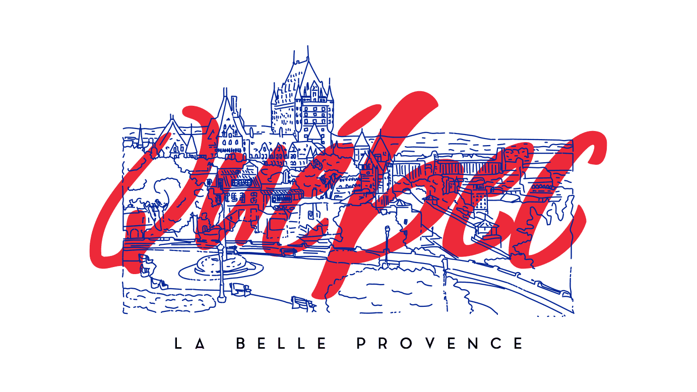
How Canadian companies adapt marketing for French and English audiences
Canadian brands that do bilingual well keep the big idea consistent, then tune the execution so it feels native in each language market. Here are three real-world examples of businesses that aced Canadian marketing.
McDonald’s du Canada: Face-à-face épique (2024)

Source: McDonald’s Canada via Grenier
McDonald’s brought back its iconic hockey rivalry concept with Auston Matthews and Connor McDavid, then reshaped the Quebec execution with P.K. Subban’s involvement and French-first product names built for local ears (Big Mac-David, Quart Papi Matthews BBQ, Poutine P.K.).
Practical takeaway: Start with one strong campaign idea, then localize the Quebec creative so it sounds like it was born there. Names, phrasing and spokesperson choices do more work than a literal translation ever will.
Interac: “Money Movers” and Quebec’s Moving Day
Interac centered its campaign on July 1, a date traditionally known as “Moving Day” in Quebec. The creative focused on real moving-related payments and used Montreal locations, real reactions and visual humour that matched local taste. While the brand’s core product stayed the same, the story changed to fit the moment (and include cultural references).
Practical takeaway: Improve your Canadian marketing by including a local trigger. When your campaign connects to something people already experience, your message lands faster and feels relevant without extra explanation.
TELUS Mobility: Bilingual out-of-home that respects attention span
TELUS has long run bilingual posters and billboards across Canada. The executions work because the brand is built for speed:
- Short copy
- Clear hierarchy
- Enough space for both languages to be read without effort

Source: TELUS Mobility 2009 Campaign by Sylvain Allaire via Behance

Source: TELUS Mobility 2009 Campaign by Sylvain Allaire via Behance
Practical takeaway: Design bilingual signage and other assets for how they’re consumed. If someone can’t understand your message in a few seconds, simplify the copy or separate the languages.
How to write effective marketing messages in English and French
Once the strategy is set, execution decides whether bilingual marketing actually works. Let’s look at the best practices for writing English and French copy that stays clear, on-brand and persuasive without turning into a translation headache.
1. Start with clarity (works in both languages)
Clear writing travels better between languages. Complicated writing doesn’t.
Opt for short sentences, plain language and concrete offers. Skip idioms, slang and clever turns of phrase that only work in one language. At the end of the day, if something needs cultural context to make sense, it’s already risky.
Most importantly, keep the offer identical in both languages. Dates, prices, discounts, conditions, guarantees and fine print should match exactly. Customers notice inconsistencies, and nothing kills trust faster than seeing two versions of the same deal.
2. Match tone and formality (especially in French)
Tone choices matter more in French because formality is baked into the language.
The key decision is tu vs vous:
- Vous is the safe default for most businesses. It signals professionalism and works across industries, age groups and price points.
- Tu can feel friendly and modern, but it’s situational. It works for youth brands, lifestyle products, casual food concepts or communities where familiarity is part of the appeal.

Source: Bilingual signage by Telus via Language Solutions
The mistake many brands make is switching tone without realizing it. English copy sounds relaxed; French copy turns formal. And suddenly, the brand feels split in two. To avoid this mistake, decide on tone early, document it and stick to it.
3. Write bilingual-friendly headlines and CTAs
Headlines and calls-to-action shouldn’t be translated word-for-word, but rather push the same action. Focus on intent. If the English CTA is about speed, the French version should feel just as direct, even if the structure changes.
Here are a few solid English/French CTA pairs that work across Canadian marketing channels:
- Book now → Réserver maintenant
- Get a quote → Obtenir un devis
- Learn more → En savoir plus
- Order online → Commander en ligne
- Find a location → Trouver un point de vente
A good example comes from Hain Celestial’s BluePrint Juice launch. The brand’s English slogan, “We Think. You Drink.” wasn’t translated literally. For Quebec, it became « Une boisson mûrement réfléchie » (word-for-word, “A carefully considered drink”).


4. Keep your brand voice consistent across both languages
Your French copy shouldn’t sound like it belongs to a different company.
One simple way to prevent drift is a mini glossary. Nothing fancy, just a short list that includes:
- Preferred translations for product and service names
- Words you always use (and ones you avoid)
- Tone notes like formal vs casual, playful vs direct
This is especially useful when multiple people touch your content or when you work with freelancers. It keeps your English and French aligned without micromanaging every sentence.
5. Quality control that’s realistic for small businesses
Not every piece of copy needs a professional translator, and not every piece of copy belongs in the DIY pile. A simple rule helps: handle low-risk content in-house, then bring in help for anything that carries real consequences.
- Internal drafts, quick updates, social posts and short-lived promos are usually safe to manage yourself.
- Core website pages, paid ads, pricing details and anything legal or highly visible deserve a pro, because mistakes there cost money or trust.
No matter who writes it, do a quick sanity check before publishing. Watch for French that feels stiff or oddly formal, service or product names that change from one version to the other and literal translations that technically “work” but don’t say what you mean.
How to create bilingual signage and other print marketing materials that people can read
Once the words are solid, design takes over.
Instead of trying to cram everything onto the page, focus on clarity. Bilingual print should be easy to scan, easy to understand and confident enough that people don’t have to work for it.
3 proven bilingual layout structures (and when to use each)
Most bilingual print relies on a few layout structures that work again and again. The trick is choosing the right one for the situation.
Stacked sections (English, then French)
This layout places one language above the other. It’s clear, predictable and easy to follow. It works well for flyers, posters, menus and notices where people expect to read top to bottom. Use it when the content is short, and both languages need equal visibility.
Side-by-side columns
Each language gets its own column. This format works best when space allows and when readers may want to compare quickly or jump straight to their language. It’s common in brochures, information sheets and larger posters. It needs strong spacing and alignment, or it turns messy fast.
Two-sided layouts (one language per side)
One side English, one side French. Clean, flexible and popular for business cards, postcards, rack cards and handouts. This approach keeps each language uncluttered and gives designers more breathing room.
Pick the structure first. Then design inside it. That decision alone prevents most layout problems.
Visual hierarchy rules that prevent clutter
Bilingual or not, good design follows the same hierarchy. The difference is that bilingual layouts punish shortcuts.
Every piece should guide the eye in a clear order: headline, supporting line, key details, call to action. If that path isn’t obvious, people stop reading.
Spacing does more work than decoration. White space, dividers, icons and consistent alignment separate languages better than squeezing text tighter.
Avoid relying on colour alone to tell languages apart. Colour can help, but it shouldn’t be the only signal.
What “good bilingual design” looks like on each product
Different print products solve different problems. Bilingual design should respect that.
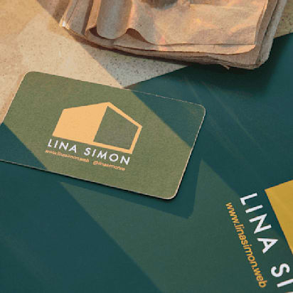
Bilingual business cards
Business cards work best when they stay disciplined. Aim for a single, obvious hierarchy and resist the urge to explain too much. Two-sided cards usually give each language the breathing room it needs.
If you place both languages on one side, keep it to the essentials: name, role and contact details.

Bilingual flyers
Flyers are typically skimmed, not read line by line, which makes structure critical. Stacked sections or two-sided layouts keep the message easy to follow without forcing readers to hunt for their language.
Headings should signal language choice immediately, while the body copy stays tight and scannable.

Bilingual brochures
Brochures reward planning. Use the panel structure to separate languages cleanly and repeat headings so readers always know where they are. Each section should flow naturally into the next, with no guessing or backtracking.

Bilingual signage
Signage has the shortest attention window of all. People read it at a distance, often while moving. Keep the copy brief, the contrast strong and the hierarchy unmistakable.
High-impact places to distribute bilingual print
Design only matters if the material shows up where your customers already are. Bilingual print works best when distribution is intentional, not random; you don’t want to leave a stack somewhere and hope for the best.
A few high-impact places to start:
- Events, markets and community centres where audiences are naturally mixed
- Partner locations like cafés, gyms, salons and clinics that share your customer base
- Local boards and notice areas (where permitted) in libraries, arenas and community hubs
- Packaging inserts for ecommerce and delivery orders, where the customer is already paying attention
Match distribution to audience reality. For instance, tourist areas benefit from fully bilingual materials; Quebec calls for French-first emphasis; mixed communities work best with bilingual print paired with a bilingual landing page.
Connect offline and online for a seamless bilingual experience
Great print gets attention. Then people pull out their phones. If the digital follow-up doesn’t match the language and clarity of your print, you’ve just paid for a very expensive dead end.
Make the handoff frictionless
Your flyer, card or bilingual signage should never drop someone into a single-language online experience. The transition needs to feel smooth; otherwise, you lose the momentum you just earned.
Aim for print that leads to:
- A bilingual website experience: At minimum, give visitors an obvious language switch that’s easy to spot and doesn’t reset the page.
- Language-specific landing pages: These work especially well for promos, events, seasonal offers and paid campaigns. Keep the English and French pages aligned on the offer, then let the tone and phrasing feel natural in each.
- Bilingual social profiles (where relevant): If you serve a mixed community or sell across regions, your bio, highlights, pinned posts and contact info should support both languages. You don’t have to duplicate every post, but the essentials should be accessible.
QR codes and short URLs done right
QR codes can save space and reduce clutter, but only if you set them up with intention. A messy QR experience makes your brand look disorganized, even when your design is beautiful.

A few setups that work well:
- One QR code that leads to a language selector page: Cleanest option. The selector can be simple: two buttons, EN and FR, then route to the right landing page.
- Two QR codes only when you truly need them: Use this when the destination pages are completely different, or when you’re targeting two audiences in the same space. Label them clearly EN and FR, and keep them visually separated so nobody scans the wrong one.
Add UTM parameters to your URLs so you can see which print piece drove traffic, which language version was used and what people did after they landed.
Ready to ace Canadian marketing? VistaPrint is here to support your French-English Canada business
Bilingual marketing in Canada comes down to smart decisions, not perfect French.
Know where your audience is, map your core message once, then write two versions that sound like the same brand. Keep offers identical, keep tone consistent and build CTAs around the action you want. When you move into print, design for speed: clean hierarchy, enough space and layouts that don’t force English and French to wrestle for attention. Finish the job by connecting print to a bilingual online path that doesn’t drop people into the wrong language.
Start with one or two high-visibility pieces and improve from there. That’s how Canadian marketing gets easier and more effective over time.
Canadian marketing FAQs
Do small businesses need bilingual marketing if they only operate in one province?
Yes, if your customers include Francophone communities, tourists or online buyers, even a limited bilingual presence can improve trust and conversion.
Can I use the same visuals for English and French marketing materials?
Usually yes, as long as the layout supports both languages clearly and the copy fits without crowding or shrinking text.
What’s the fastest way to test bilingual marketing without a full rebrand?
Start with one high-visibility asset, like a flyer, storefront sign or landing page, and measure response before expanding.