Every brand needs a colour palette for its logo – even if yours is black and white or a few shades of grey. Logo colour combinations express who a brand is. Colour works at the primal level, signaling specific emotions in the viewer’s brain. Before anybody even takes a closer look at the logo or hears the name of your business, they’ll understand who you are and what you do based on your logo’s colours.
The best logo colour combinations help small businesses communicate personality, build recognition and stand out against competitors. Learn about logo colour meanings and combinations to help pick the best colours for your brand and logo.
Check out the video below or read on to find 38 fresh colour combinations to inspire your logo design and practical tips to help small business owners apply them across real-world branding materials.
- Logo colour combinations play a major role in how customers instantly perceive your business, from your mood and personality to trust and value.
- Different colours carry different psychological meanings, and pairing them well can make your logo more memorable and effective.
- Small businesses can use colour strategically to stand out in crowded markets, attract the right audience and reinforce brand identity across marketing materials.
- Use tools like VistaPrint’s Logomaker to apply your chosen palette and bring your branding to life across your business cards, websites and more.
What does colour do?
Colour evokes emotions. Based on culture, traditions and even our own evolution, each colour has deep-rooted psychological associations. For example, yellow evokes friendliness, while brown is more rugged and natural. For small businesses, logo colour meanings trigger these emotional cues, helping your brand signal value and personality before a customer reads a single word.
Aesthetically, colour can play lots of different roles in logo design. You can use colour to enhance design elements or to set a tone, whether it’s the focal point or working quietly in the background. Colours tell stories, convey moods, communicate price points and connect ideas.
Sometimes, using black can make the other colours in a logo pop. In other logos, black is the main event.
Colours do it all – and they do it in an instant. That’s why it’s important to explore all of your colour options and choose the right combination for your logo and brand identity.
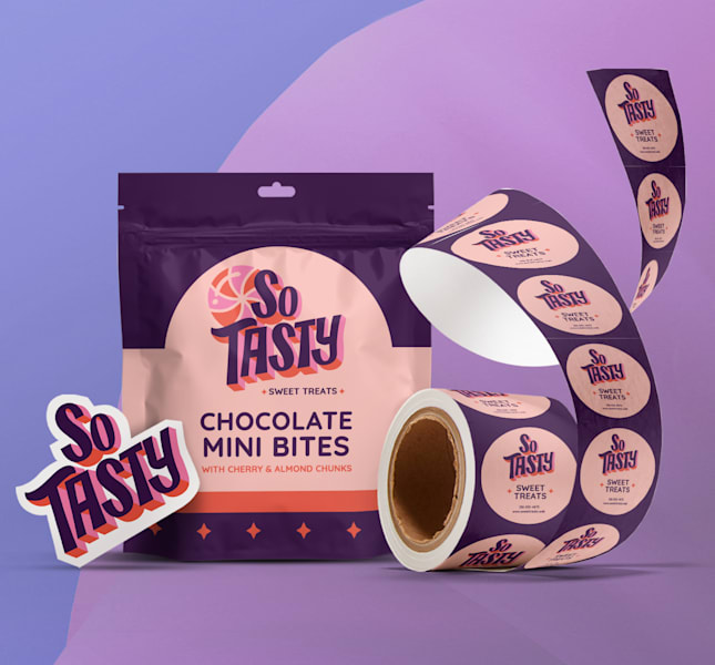
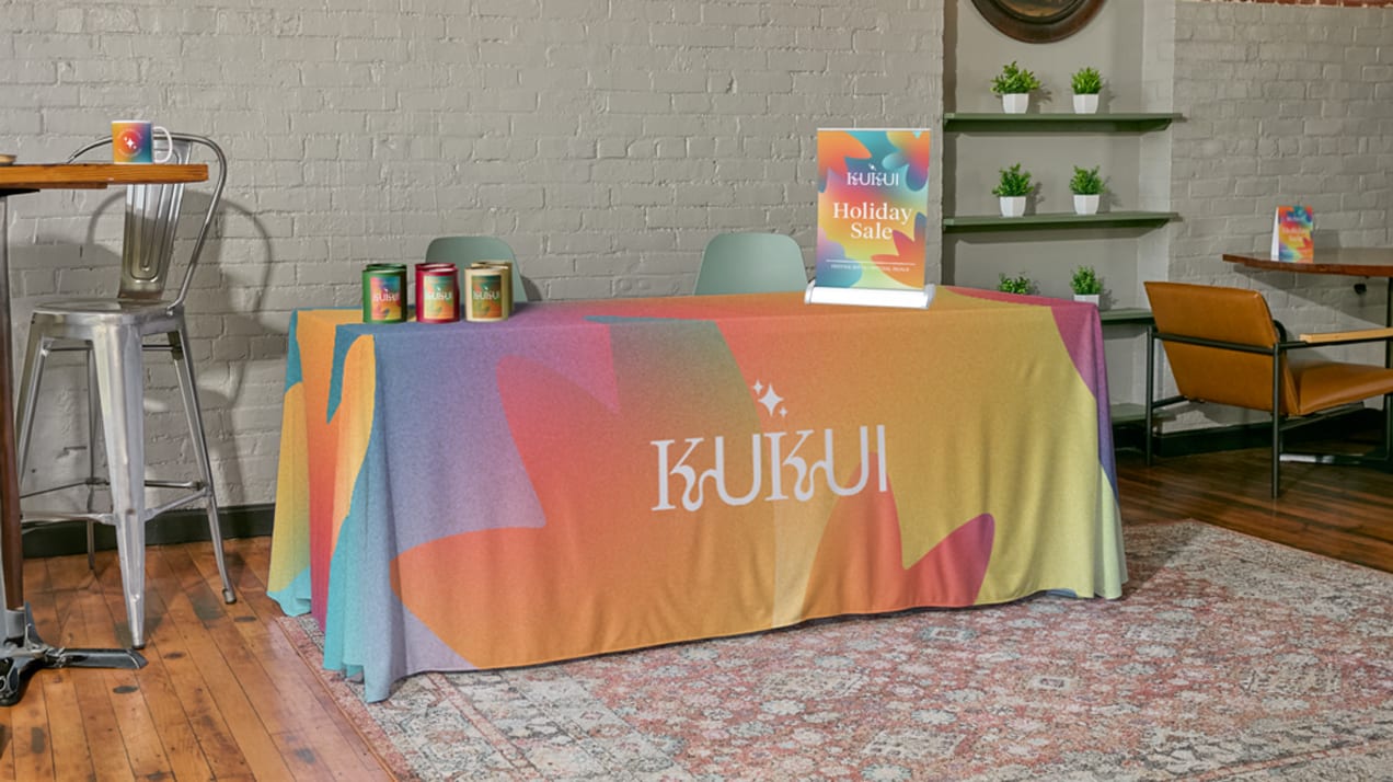
Your logo colours are a core part of your brand identity, helping to communicate your values, tone and positioning across every touchpoint from your website and social channels to your packaging, signage and printed materials. Used thoughtfully, colour reinforces recognition and builds trust over time.
If you want to dive deeper into colour theory fundamentals, read our article on the psychology of colours.
How many logo colours do I need?
There’s no set rule on the number of colours you should use in your logo. How many colours you need depends on what your logo has to say for your brand. For example, small businesses offering premium or minimalist services may prefer a simple palette, while more playful or lifestyle-focused brands are well suited to multiple accent colours.
Most logos use two or three distinct colours. Typically, it’s one primary colour and one or two accent colours. But there are also great logos that only use one colour. Sometimes all you need is a single strong hue or variations of the same shade. Other times, a broader palette helps to communicate your brand’s personality better.
It’s also important to remember that not every version of your logo needs to use every colour in your palette. Many brands create flexible logo variations like full-colour, single-colour or black-and-white versions to ensure that their logo works across different backgrounds, formats and use cases, from social media icons to merchandise and signage. Find out more in our blog about how to choose a logo for your small business.
34 logo colour combinations for 7 brand personalities
To make this guide easier to explore, we’ve grouped the best logo colour combinations into themed categories based on the strongest personality of a brand. Each section includes small-business tips to help you understand when and why you might use these combinations.
Confident and reliable logo colour combinations
Logo colour combinations that convey confidence and reliability are bold but grounded. They use high contrast along with strong colours.
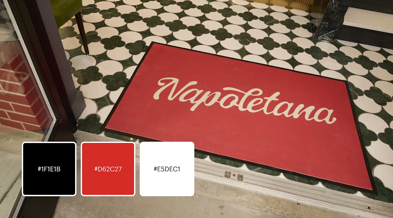
Red, black and white
Red is a striking colour, sure to portray confidence. With the reliable black and white, a logo complements the urgency of red with softer accents. For small businesses, this trio is highly versatile for signage, packaging and uniforms.
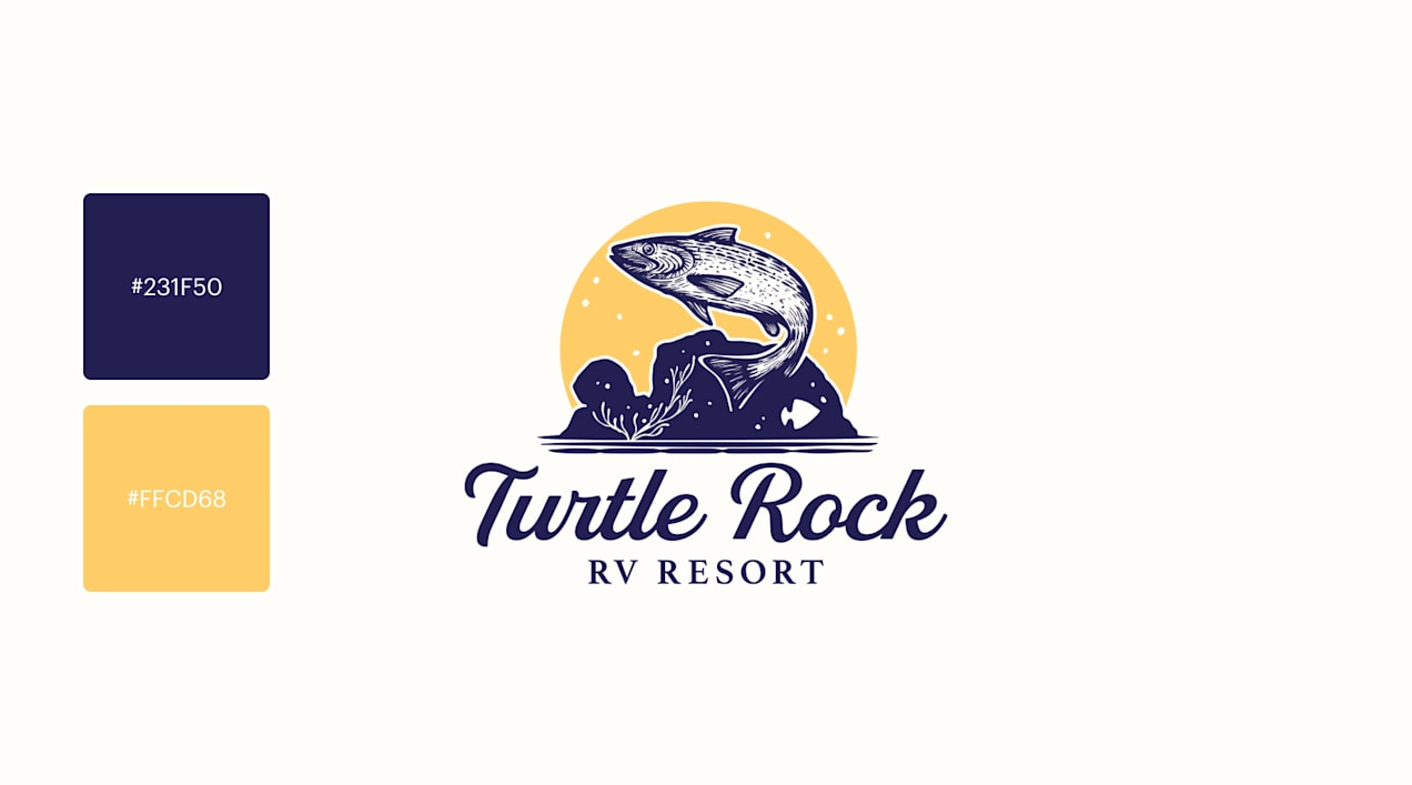
Blue and gold
Warm colours aren’t the only confident colours, though. A high-contrast combination – pairing colours on the opposite sides of the colour wheel – is a bold one, like a logo that pairs a bright gold against blue. It’s great for service-based small businesses wanting a premium yet approachable feel.
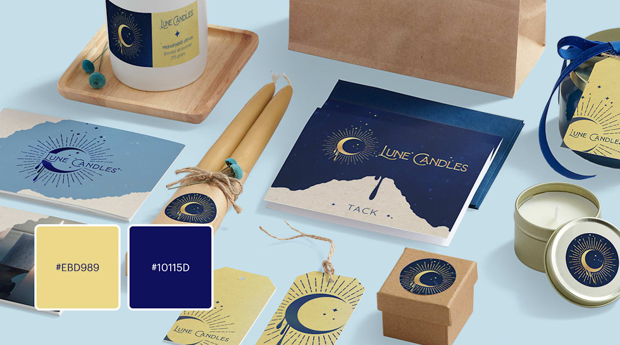
Navy and goldenrod yellow
In a navy, white and yellow combination, navy grounds the palette, allowing brighter accents to stand out. This palette is often used by sports clubs, fitness brands and businesses catering to active lifestyles that want to feel dynamic, confident and reliable.
Source: Logo design by Yo!Design via 99designs by Vista
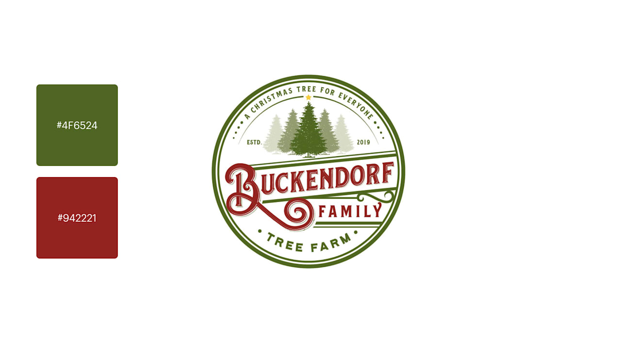
Reds and greens
With its combination of high-powered energy and natural calmness, red and green can feel both bold and balanced – giving a sense of confidence and reliability. For a modern take, try softer versions like coral and sage for a fresher, less seasonal look.
Source: A red and green logo by anilokin via 99designs by Vista
Rugged and natural logo colour combinations
Capture the magic of nature with palettes inspired by landscapes, textures and organic materials. These combinations feel rugged making them perfect for artisan makers, local food brands, outdoor retailers and wellness companies.
Traditional earth tones
Earth tones such as olive green, clay brown, sand beige and soft charcoal are go-to colours for rugged or nature-based brands. These colours work especially well for small businesses that value craftsmanship, sustainability or tradition like farm shops or handmade goods.
Greens and browns
A direct, literal colour palette can clarify your brand and industry, which is why you see so many green garden and landscaping logos. This combination works especially well for gardening or landscaping businesses, organic food brands, wellness studios and artisan makers that want to emphasise their sustainability, craftsmanship or a connection to nature. If you feel like it’s overused in your sector, consider using richer or more unexpected shades of green.
Source: A green and brown logo design by tasa via 99designs by Vista
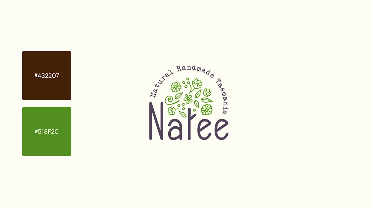
Brown and black
Nothing says rustic like brown and black. Use this combination when you want to communicate heritage, durability or artisanal workmanship.
Source: Logo design by TheBluebird via 99designs by Vista
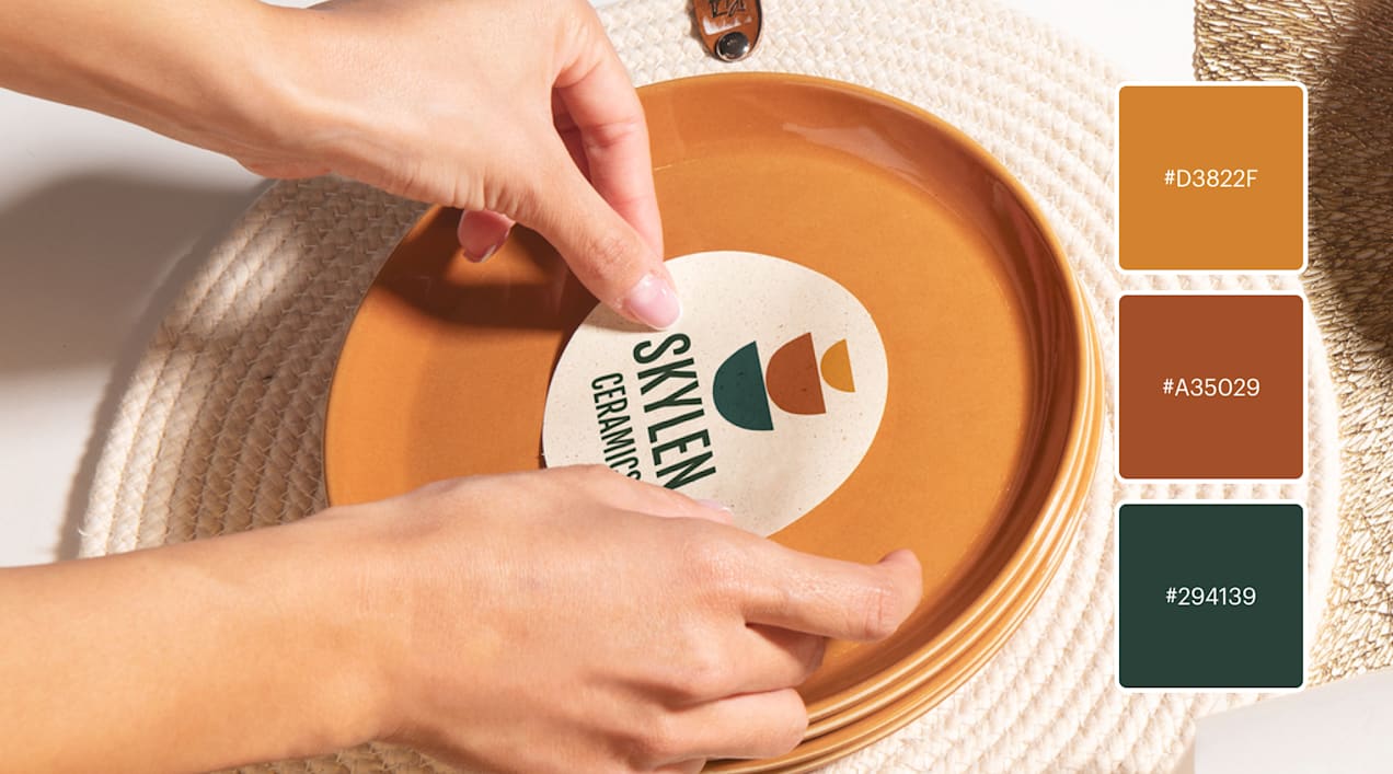
Reinterpreted earth tones
Nature-inspired palettes can also feel modern – just take inspiration from unique landscapes. Try working in terracotta, muted mustard, dusty rose or warm ochre for an earth-tone scheme with personality. Modern earth tones work well for interior design studios, sustainable fashion brands and creative small businesses looking to communicate their authenticity with a contemporary edge.
Source: An earthy logo design by cuteskullstudios via 99designs by Vista
Serious and sophisticated logo colour combinations
If you’re in an industry where professionalism is a selling point, the best colour combinations are those that use neutrals and deep shades, like black and white logos. These colours help small businesses signal trust, competence and expertise.
Black and white with bold accents
Black is always in style – and serious. Add bright accents for a splash of colour. Think crimson instead of cherry or lime instead of green. This palette is clean, timeless and highly versatile across printed and digital brand assets, and it works well for consultants, legal services, luxury brands and premium service providers.
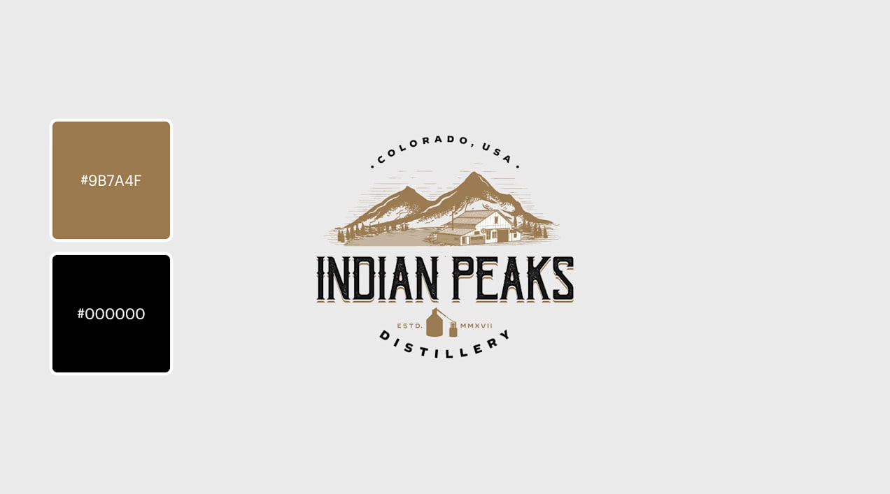
Caramel and coffee bean
Brown and beige tones create a refined, heritage-inspired palette. Use different shades to add depth and detail. This is ideal for artisan brands, cafes, traditional businesses or anything that values craftsmanship.
Source: Logo design by Spoon Lancer via 99designs by Vista
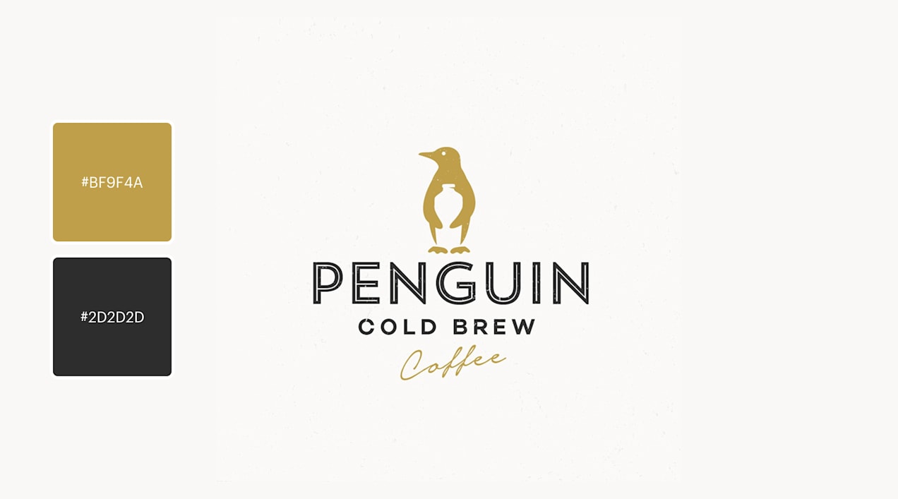
Grey and gold
This combination of muted, understated colours creates an elevated, professional look. Paired with clean typography, you get a logo with a quiet confidence and sophistication. This refined palette works well for premium service providers, consultants and boutique brands aiming to project sophistication, experience and a feeling of understated luxury.
Source: Logo design by Evan C. via 99designs by Vista
Blue green and soft coral
Navy warmed by hints of green and mute coral creates a refined take on complementary colours that feels balanced, natural and quietly luxurious. The softened contrast evokes calm confidence, craftsmanship and thoughtful restraint. This kind of colour pairing is especially well-suited for boutique food brands, lifestyle and home goods companies, hospitality or wellness brands that want to communicate sophistication, quality and timeless appeal rather than trend-driven boldness.
Source: Logo design by Spoon Lancer via 99designs by Vista
Creative logo colour combinations
For original and innovative brands, logo colour combinations should be unique and colourful – this captures creativity with eye-catching energy and gives a sense of adventure.
Plum purple and orange
Purple and orange may not be exact colour opposites, but their contrast is striking. This makes the pair a great choice for creative industries or brands targeting younger audiences.
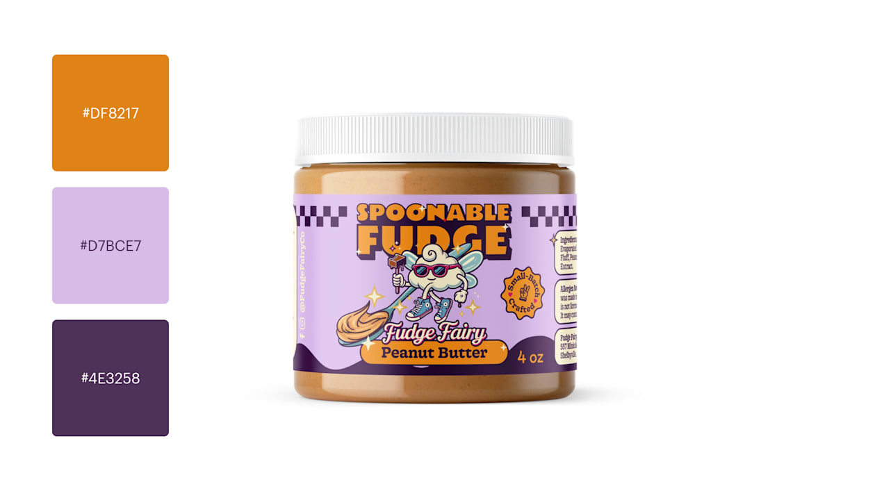
Source: A purple and orange logo by athenabelle via 99designs by Vista
Olive green and pimento red
This earthy-meets-vibrant colour combination creates a bold look that still has a foundation in natural tones, making it a strong choice for outdoor brands, wellness businesses, sustainable products or modern lifestyle companies that want to stand out while still feeling grounded.
Source: Logo design by aran&xa via 99designs by Vista
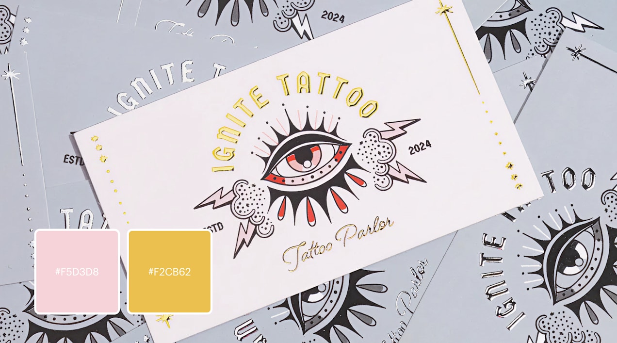
Baby pink and gold with high contrast accents
This palette reimagines the traditional pairing of bold black-and-white with red and gold accents with an unexpected touch of baby pink that softens everything in a refreshing way. The contrast between delicate pastel tones and high-impact colours creates a look that feels both classic and modern, tough yet refined. This kind of palette works especially well for tattoo parlors, beauty brands, fashion studios or creative businesses that want to signal confidence and edge while still feeling curated, expressive, and approachable.
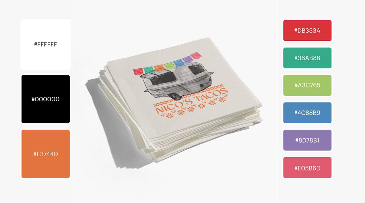
A rainbow
Typically, logos have one colour and a few accents – but some brands benefit from breaking the rules. Up your fun factor with a rainbow of colours. Just make sure each shade is intentional so your palette stays balanced and readable. Here, the brand uses the shape of the taco truck decorated with a rainbow of Mexican papel picado. Brands can use a rainbow to communicate diversity, creativity or joy, ideal for community groups, event planners or kids’ brands.
Green and purple
Green and purple surprisingly complement each other when balanced well. Green softens the intensity of purple, making the palette more accessible while keeping a unique, creative feel. Small businesses like creative agencies, florists or playful retail brands can benefit from the contrast of this palette.
Source: A logo design by ilkapoc via 99designs by Vista
Sincere and authentic logo colour combinations
Use these calm logo colour combinations when you want your brand to project authenticity, care, trustworthiness, sincerity or wellness. For more inspiration for creating an effective and sincere brand, explore our 6 key principles of logo design.
Navy blue and light pink
This combination emphasises peace with a cool and warm colour that blend together. Peaceful palettes rely on subtle contrast and soft colours. Navy and light pink are a strong fit for service-based businesses like wellness clinics, boutique consultancies and lifestyle brands that want to balance a feeling of professionalism with warmth and approachability.
Source: A navy and pink logo design by moxiemason via 99designs by Vista
Shades of green and blue
Combining different shades of green and blue in your logo has a calming, soothing effect and works great for brands that want to put their clients at ease. It’s great for eco-brands, professional services or sustainable products.
Source: Logo design by Luis Vásquez — VASK via 99designs by Vista
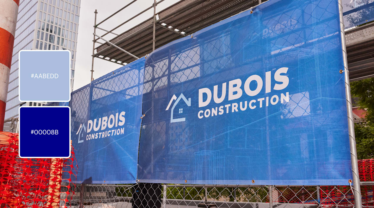
Dark blue and light blue
In colour theory, dark blue and light blue represent two different psychological signals: trust and approachability. Put them together, and you get a trustworthy logo that balances authority with warmth. Dark and light blue together are well suited to financial services, healthcare providers and small businesses that need to balance their authority with approachability. Here it works well for a building company.
Beige and blue
Cold colours like blues and purples feel serene, familiar and even spiritual while beige adds warmth. This is a soft, familiar palette for any business that wants to evoke nostalgia and confidence as well as a bit of exclusivity.
Green, yellow and orange
Green and yellow sit right in the middle of the colour spectrum, and they feel balanced. Adding orange gives a touch more energy, helping the logo stand out without breaking the peaceful feel. This palette suits community-focused businesses, family-friendly brands and health or fitness services that want to feel energetic, inclusive and optimistic without being overwhelming.
Source: Logo design by Project 4 via 99designs by Vista
Blush pink, grey and yellow
This soft, modern palette balances warmth and neutrality. Blush pink and sunny yellow pair beautifully with grey to create an elegant, approachable look. This trichromatic palette works well for creative studios, wellness brands and boutique retailers that want a soft, modern look with a touch of optimism.
Source: Logo design by ananana14 via 99designs by Vista
Playful and fun logo colour combinations
Whimsical + colourful = fun. Bright, warm, contrasting colours are loads of fun, as are neon and “unnatural” colours like pink, purple and lime green.
Bubblegum pink and cyan
Pink and cyan create a bright, playful palette that feels fresh and modern. Choose this pairing if you’re aiming for high-impact colour with youthful energy – great for the lifestyle and event industries.
Source: A pink and turquoise logo design by board via 99designs by Vista
Orange and tomato red with blue and chartreuse accents
This palette feels energetic and inventive, balancing freshness with warmth and playful contrast. This mix works well for creative studios, food and beverage brands, startups and youth-focused companies that want to feel bold, modern and full of personality without becoming overwhelming. Make the colour combination your own by exploring interesting shades, like a mint green, coral pink or bright lemon yellow.
Source: Logo design by Julie via 99designs by Vista
Yellow and orange
A mustard yellow and marigold orange palette brings warmth, playfulness and high-energy optimism to a logo, creating an immediate sense of joy and approachability. This palette is especially effective for children’s brands and family-focused services. It also works well for creative studios, food brands and companies that want to communicate enthusiasm, friendliness and a feel-good personality.
Source: Logo design by casign via 99designs by Vista
Shades of teal
A palette built around different shades of blue-green feels fresh, playful and a little magical, evoking ocean energy and unmistakable mermaid vibes. It’s a great fit for swimwear, beauty, wellness and creative studios. And, like the iconic brand – Tiffany and Co. – teals are great for lifestyle brands that want to feel fun, modern and effortlessly cool while still staying polished.
Source: Logo design by solvi_designs via 99designs by Vista
Pink, purple and blue with yellow accents
This colour combination feels whimsical, nostalgic and joyfully imaginative, calling to mind classic candy wrappers and playful confectionery displays. Pinks and purple with accents of blue and yellow are ideal for candy brands, dessert shops, children’s products and entertainment brands that want to feel fun, indulgent, and full of personality.
Source: Logo design by Salazar Studio® via 99designs by Vista
Primary colours
Bright, primary colours – red, yellow and blue – often signify that a brand is for kids. But because of this association, they are also effective colour options to make your logo fun and playful. These colours work well for education, toys, children’s services and family-friendly brands.
Exciting and energetic logo colour combinations
For brands that want to project adventure, energy and visibility, use bold logo colour combinations with high contrast and saturation.
Orange and red
There’s a reason why red is so popular for sports team logos – it’s full of energy! If your brand needs a loud, high-impact palette, pair bright orange and boisterous red. This combination is great for food businesses, fitness studios or small businesses competing in busy markets.
Black and yellow
The colour combination of black and yellow can look like a warning – great for grabbing attention. These two colours draw out each other’s strengths to convey urgency and excitement. They’re great for trades, delivery services and brands that also need to signal reliability and speed.
Pastel pinks and lavender with chartreuse
The low-contrast palette of soft pinks and lavenders is energized by unexpected olive or chartreuse accents. Muted pastels create a calm, natural base, while the sharper green tones add a sense of freshness and modern edge, helping brands feel both nourishing and forward-thinking. This palette works especially well for health food companies, wellness brands or plant-based startups that want to feel new, hip and design-led without losing a sense of softness and approachability.
Teal and orange
While less intense than red and blue, the teal and orange combination is still an attention-grabber, and offers a more approachable, playful mood that’s good for tech startups, fitness studios or food businesses.
Source: Logo design by Hants ℠ via 99designs by Vista
Primary colour changeup
This palette of near-primary yellow, red, purple and green anchored by black accents feels bold, graphic, and unapologetically playful. The strong contrast and clear colour signals make it especially effective for entertainment brands, children’s products, creative collectives and pop-inspired food or retail businesses that want to stand out instantly and feel high-energy and fun.
Source: Logo design by reza ernanda via 99designs by Vista
Bright purple and peachy pinks
Purple and pink complement each other well while still feeling bold and expressive. A purple and pink logo combines the fun and youthfulness of pink with the creativity and depth of purple. This combination is often used by beauty brands, creative agencies and sweet treat businesses that want to feel expressive, confident or emotionally engaging.
Source: Pink and purple logo design by unigramstudio via 99designs by Vista
Creative ways to use your logo colour combination
Once you’ve picked a colour palette, the next choice is how to create a logo with it. There are countless creative approaches, from using gradients to assigning a colour to each letter, and each choice helps reinforce your brand personality.
Gradients
Gradients are a powerful way to put a whole colour palette on display. Smooth and serene, they easily fade from one colour to the next, creating beautiful in-between shades that add visual depth. Your gradient logo could be subtle, moving between two fairly close colours or it can be a rainbow, going from one bold colour to another and meeting plenty of others along the way. That said, use gradients sparingly as they work best for digital-first brands.
Geometry
When you use geometric shapes in your logo, you can further influence customer perceptions of your brand by choosing shapes that fit your brand personality. Circles and ovals tend to feel friendly, squares feel reliable and triangles feel dynamic, efficient and serious.
Pick your logo colour combination
Choosing logo colour combinations takes exploration and experimentation, but it’s one of the most rewarding parts of building your brand. Play with colours and combinations to find the ideal palette that reflects your personality, values and audience. Explore logo design trends, test combinations with real customers and be open to refining your palette over time.
Logo colour combination FAQs
How do I choose the best logo colour combinations for my small business?
Start by identifying your brand personality and target audience. Then choose colours that align with the emotions you want customers to feel. Test a few palettes in real-world applications like social media posts or business cards.
How do I implement my colour combinations effectively in a logo design?
Start by assigning roles to each colour: one primary colou and one or two accents. Your primary colour should appear most often, while accents highlight key elements like icons or lettering. Keep contrast in mind so your logo stays readable at small sizes or on printed materials like business cards or signage. Review our logo design guide for more detailed tips.
How can I use colour to connect with my audience?
Think about the emotions and expectations of your target customers. For example, eco-conscious audiences respond well to greens and neutrals, while younger audiences often respond to brighter, more playful colours. Use colour psychology to reinforce the feelings you want customers to associate with your brand.
How can colour help me stand out from competitors?
Research your competitive landscape. If everyone uses green, for example, choosing a unique accent colour or a richer shade can help differentiate your brand.
Can I change my logo colours later?
Yes. Small businesses often refine their colour palettes as they evolve. A subtle shift (like changing saturation or adding an accent colour) can modernize your brand without losing brand recognition.
What’s the safest number of colous to use in a logo?
Most logos work well with 1 to 3 colours. Too many can feel cluttered. But if your concept calls for more (for example a rainbow), use intentional balance, white space and contrast.


